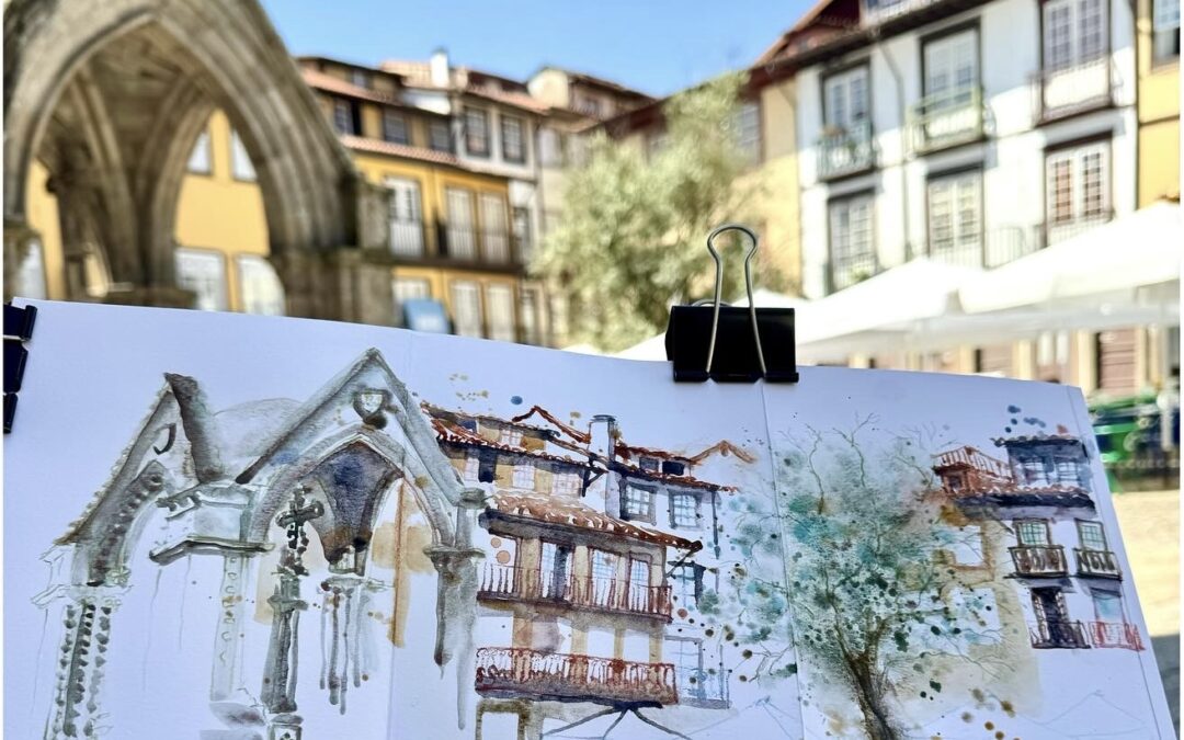
I have been looking at old sketchbooks again to see how my skills and style evolved. What I notice is that the 2015-me was so afraid to express herself and afraid to ruin the sketchbook, that the drawing is barely visible… no shadows, very weak colors and weak line work… 2015-me was so unsure of herself and scared to make a bad drawing that it took her ages and a lot of workshops before she dared to use the colors that made her happy.
In my YouTube video here I share a video I made in Lisbon last spring, and in the introduction of the video I show my 2015 sketchbook with 3 sketches I made in Lisbon and Portugal.
I have such a hunger for color for the moment that I also use a lot of color pencil lines in my sketches!
They make me truly happy!
I hope they make you happy as well. Color brings me comfort and joy. It makes the world warm and glorious, especially autumn colors now here in Brussels. We have a magnificent autumn.
When I travel somewhere I always look for pictures to see what colors there are. Portugal is an “explosion” of colors…!
The Lisbon video is part of my Skillshare class, but of course in the Skillshare class it comes with a lot of explanations. (With this link you can try the platform for free for 30 days)
So this is the advice I would have given to myself in 2015:
- Add flashy colors to grab attention – Throw in all the bright colors you like, and bam! Everyone’s looking right where you want!
- Mix styles, because who cares about rules? – Combine color pencil, ink and watercolor for a “I’m totally embracing my artistic chaos” effect.
- Add little scenes of local life – A wandering cat, an abandoned café table… the kind of details that’ll make people think you observed every little thing (even if you didn’t).
- Exaggerate shamelessly – Think that tower could be bigger? Make it XXL! We’re not here to respect proportions and “Sketching Police” won’t come after you if the drawing is not correct.
- Use washes for a “moody mist” effect – A few diluted brushstrokes and bam, you’re suddenly a weather expert!
- Add texture without spending a cent – Use an almost-dry brush, and suddenly those stones look so real you could almost touch them.
- Try wild unreal perspectives – From below, from above, tilted… as if you’d slipped while taking the reference photo.
- Color shadows like a rebellious artist – Instead of boring gray shadows, go for improbable colors, just to see the reactions of your viewers.
- Add arrows and annotations for the “tour guide” effect – A little box here, an arrow there, and voilà! You’ve got a mini travel guide on paper.
- Let water inspire you for a zen effect – Play with the water level in your brush and let the color wander wherever it wants, in full “letting go” mode.
- Get fancy with atmospheric perspective – Keep faraway elements in light tones, like you’re drawing in thick fog (or like you forgot your glasses).
- Sketch both inside and outside; don’t be picky! – Mix landscapes with cozy interiors for a travel journal that’s as complete as a guided tour.
- And most importantly, don’t forget the humor. Don’t take yourself so seriously! Life’s too short to count windows (Says Ian Fennelly)
Do you keep your older sketchbooks? And do you look at them from time to time to see your progress?
What would you say to your younger self?


Hallo Barbara, wat een leuke video en inspirerende text. Bedankt om het te delen en ik wens je nog spetterende herfstkleuren en plezier met de gemengde technieken.
Luk